Crafting the Digital Future: unveiling Web Development Best Practices

Following best practices is the navigator that points us in the direction of producing outstanding digital experiences in the quick-paced and always-changing field of web development. In addition to being masters of code, web developers are the digital era's storytellers, creating the online personas of individuals, companies, and brands. Gaining success in this fast-paced industry requires that you comprehend and put into practice the basic ideas and methods that supportefficient web development. Our user-centred, safe, and extremely functional websites are built on top of these best practices, which range from planning and preparation to security and performance optimization. As we looked into web development best practices, we set out to uncover the crucial elements that transform lines of code into engaging, approachable, and innovative online experiences. New technologies and fashion trends are always emerging in the web development industry, which is always changing. Having a solid online presence is crucial for both individuals and organizations in this digital age. Web development best practices are essential to producing amazing websites that satisfy users, load fast, and keep security. We will examine the essential ideas, methods, and tactics in this extensive manual so that you can succeed in web development.
1. Planning and Preparation
- Specify Your Objectives: A clear grasp of your objectives is the first step in any successful web development project. Whether you're building a sophisticated e-commerce platform or a personal blog, you must first determine your goals, target market, and problem to be solved.
- User-centered design: User-centered design is the practice of producing with the user in mind. Create user profiles, evaluate usability, and ensure that your website's design and navigation are intuitive and clear.
- Mobile-First approach: Since the majority of customers are increasingly using mobile devices to access the internet, it is imperative to execute a mobile-first approach. Design your site for smaller screens first and then scale up for larger devices. This ensures a better user experience for all.
2. HTML and CSS Best Practices
- Semantic HTML: Use semantic HTML tags to structure your content properly. Semantics not only improve accessibility but also help search engines understand and index your content correctly.
- Clean and Effective CSS: Create modular, well-organized, and easily maintainable CSS. To make your stylesheets more efficient, use CSS preprocessors like Sass or LESS.
- Responsive Design: if the website is made responsive, then it adapts to various screens. Media queries and flexible layouts are key tools for achieving this.
- Optimized Images: Optimize images to reduce page load times without sacrificing quality. Use appropriate formats (JPEG, PNG, SVG) and consider lazy loading for images below the fold.
- Accessibility: make sure that even those users with a disability can access the website. Use ARIA roles, alt text for images, and provide keyboard navigation support.
3. JavaScript Best Practices
- Minimize HTTP Requests: Reduce the number of HTTP requests by bundling and minifying your JavaScript and CSS files. This reduces page load times, improving the user experience.
- Use Asynchronous Loading: Leverage asynchronous loading techniques for non-essential scripts. This prevents blocking of critical page resources and enhances performance.
- Code Splitting: Split your code into smaller modules and load them only when needed. This can significantly improve loading speed and reduce initial page load times.
- Optimize JavaScript Performance: Write efficient JavaScript code. Avoid unnecessary loops and optimize algorithms. Consider using performance analysis tools to identify and address bottlenecks.
- Progressive Enhancement: Adopt a progressive enhancement approach to ensure that your website works on all browsers and devices. Start with basic functionality and enhance it with features that require more advanced technologies.
4. Performance Optimization
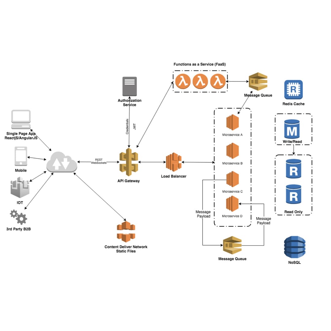
- Page Speed: Page speed is crucial for user satisfaction and SEO. To expedite the transmission of content, reduce server response times, activate browser caching, and take advantage of content delivery networks (CDNs).
- Content Compression: To minimize the amount of data exchanged between the server and the client and to speed up loading times, use GZIP or Brotli compression.
- Browser Rendering Optimization: Optimize the Critical Rendering Path by eliminating render-blocking resources and deferring non-critical scripts. Use efficient CSS and JavaScript.
- Lazy Loading: Implement lazy loading for images and other non-essential resources. This defers loading until the user needs them, improving initial page load times.
- Content Delivery Networks (CDNs): Utilize CDNs to distribute your content to servers geographically closer to your users and as a result the delivery is sped up and delay is reduced simultaneously.
5. Security
- HTTPS: Implement HTTPS to encrypt data transmission and build trust with users. Using an encrypted Sockets Layer (SSL) certificate, you may secure sensitive data on your website.
- Input validation: Verify user input to stop typical security flaws like cross-site scripting and SQL injection.
- Protection from Cross-Site Request Forgery (CSRF): A strong defence against CSRF assaults on your website entails the generation and verification of distinct tokens for every user session.
- Content Security Policy (CSP): You can reduce the likelihood of malicious content injection by limiting the resources that can be loaded onto your website by utilizing CSP headers.
- Regular Updates: To guarantee security and repair known vulnerabilities, keep your CMS, web server, and all plugins up to date.
6. Testing and Quality Assurance
- Cross-Browser Compatibility: For the purpose of ensuring functionality and its appearance, the website should be tested on multiple browsers and devices as well. Tools like BrowserStack and CrossBrowserTesting can be helpful.
- Responsive Testing: Verify that your website looks and functions correctly on various screen sizes and orientations. Test on actual devices as well as emulators.
- Performance Testing: Conduct load and performance testing to ensure your site can handle traffic spikes without slowdowns or crashes.
- Accessibility Testing: Use accessibility testing tools such as Axe or WAVE to identify and rectify issues related to web accessibility.
- Code Review: Regularly review your code with peers to catch bugs, improve code quality, and ensure adherence to best practices.
7. Search Engine Optimization (SEO)
- SEO-Friendly URLs: Create clean, descriptive, and human-readable URLs that incorporate relevant keywords.
- Title Tags and Meta Descriptions: Optimize your title tags and Meta descriptions to improve click-through rates in search engine results.
- Image Optimization: Optimize images for search by using descriptive file names and alt text. Compress images for faster loading.
- Mobile Optimization: Make sure your website is optimized for mobile devices, as Google gives priority to mobile-first indexing.
- Superior material: Generate unique, superior material that offers your viewers something of value. Use appropriate keywords and headings.
8. Continuous Integration and Deployment (CI/CD)
- Version Control: Version control systems such as Git can be utilized to identify changes and effectively collaborate with team members. It simplifies code management and debugging.
- Continuous Integration: Set up CI tools like Jenkins or Travis CI to automate the testing and building processes, ensuring code quality.
- Continuous Deployment: To swiftly and securely push code updates to production, and automate the deployment procedure. Kubernetes and Docker are two useful tools.
- Monitoring and Error Handling: Use monitoring programs like Sentry or New Relic to proactively identify problems as soon as they arise.
- Backups and recovery: In web development, keeping backups and creating a solid recovery plan are essential procedures. And guarantees the durability and dependability of your internet presence.
Elevating Excellence: Navigating Coding Standards and Guidelines
The cornerstone of any effective web development project is clear and uniform code. It is easier to read, repair, and collaborate on code when coding standards and rules are followed. Here are some essential principles:
- Use Semantic HTML: Structuring your content with semantic HTML elements not only helps with SEO but also improves accessibility.
- Use a Style Guide: Keeping code consistent within a team can be achieved by making use of a coding style guide, such as Google's JavaScript Style Guide. Indentation, naming conventions, and other topics are also covered.
- Version Control: Use version control systems such as Git can be utilized to identify changes and effectively collaborate with team members. It simplifies code management and debugging.
- Code Comments: Write meaningful comments to explain complex sections of your code. This aids understanding for other developers and your future self.
- Testing and Debugging: It is essential to maintain a rigorous testing regimen for your code, promptly addressing any issues as they arise. The utilization of automated testing and debugging tools can greatly enhance the overall code quality, ensuring a more robust and reliable end product.
Performance Perfection: Unveiling the Art of Website Optimization
Search engine ranking and user experience are impacted by a website's performance. Take into account the following tactics to enhance the functionality of your website:
- Image Enhancement: You can compress and scale an image file to make it smaller.
- Caching: Implement browser and server-side caching to reduce redundant requests and improve load times.
- Minification: Minify your HTML, CSS, and JavaScript files to reduce their size. Smaller files load faster.
- Content Delivery Networks (CDNs): Use CDNs to distribute website content across multiple servers, reducing latency and improving load times.
- Lazy Loading: Implement lazy loading for images and other non-essential resources to ensure that the initial page load is fast.
- Responsive Design: Create responsive layouts that adapt to various screen sizes, ensuring a seamless user experience across devices.
Safeguarding the Digital Frontier: A Journey into Website Security Best Practices
Security is a paramount concern in web development. Take into account these recommended methods to safeguard user data and your website:
- SSL encryption: Secure Sockets Layer (SSL) certificates are used to encrypt data transmitted between the user's browser and the server. This is essential for sensitive data protection.
- Frequent Updates: To repair security flaws, keep all software, including plugins, libraries, and content management systems, up to date.
- Input validation: Verify user input to stop typical security flaws like cross-site scripting and SQL injection.
- Password management: Use salted and hashed passwords for user authentication and put strong password restrictions into place.
- Access Control: Verify that the appropriate access controls are in place to limit who is able to do particular functions on your website and prevent unauthorized access.
- Security Headers: To defend against frequent online security risks, use security headers like HTTP Strict Transport Security (HSTS) and Content Security Policy (CSP).
Mobile-First Marvel: Crafting Responsive Wonders and Conquering Challenges
A mobile-first approach to web design is necessary given the increase in mobile usage. Best practices for developing websites that are mobile-friendly and responsive are as follows:
- Mobile-First Design: Start by designing and developing for mobile devices, then progressively enhance for larger screens. This ensures a better mobile experience.
- Flexible Grids and Layouts: Use fluid grids and flexible layouts to adapt content to various screen sizes and CSS Grid and Flexbox can be considered as powerful tools for this purpose.
- Media Queries: Media queries can be utilized to apply different CSS styles based on screen size. This allows you to create custom layouts for various devices.
- Touch-Friendly Elements: Design touch-friendly buttons and interactive elements to accommodate touchscreen navigation.
- Performance Optimization: To improve user experience and minimize load times, optimize photos and other resources for mobile devices.
- User testing: To find and address problems, test your website frequently across a variety of mobile devices and browsers.
Web development is a vast field that covers coding standards, security, performance optimization, and responsive design. To achieve the highest standard for websites, it is imperative to adhere to best practices within each of these categories. By diligently following these guidelines, developers can craft websites that possess not only an attractive visual appeal but also exhibit swift performance, robust security, and seamless responsiveness across all platforms. The ever-evolving digital landscape necessitates continuous efforts to remain informed about the latest web development trends and best practices. This ongoing commitment is vital for upholding the usability and competitive edge of websites in a rapidly changing online environment.
A competent web developer should be well-versed in the sector, show a steadfast dedication to following industry best practices, and be flexible when incorporating new technology. Developers can design websites that prioritize search engine performance, quick loading times, strong security, and user-friendliness in addition to aesthetic appeal by adhering to these principles. Remember that the web development sector is constantly evolving. Thus, in order to deliver the best possible online experiences, be abreast of the latest advancements and continue honing your craft. Both inexperienced and seasoned developers can benefit from following these best practices when creating websites that stand out online. Your success in web development will ultimately depend on how committed you are to creating excellent work and ensuring user satisfaction.
It's not a choice; it's a need to adopt best practices in the dynamic field of web development. As we get to the end of our investigation of these guiding concepts, it is evident that these serve as the foundation for truly remarkable online experiences. From meticulous planning and meticulous coding to continuous testing and adaptation, adhering to these practices is the key to crafting websites that shine in the digital realm. Thus, let's take these vital best practice lessons with us as we continue to code, design, and improve the digital world. That way, we can make sure that our websites not only meet but also surpass the high standards of a demanding and diversified online audience.
Recent Stories


500k Customer Have
Build a stunning site today.
We help our clients succeed by creating brand identities.
Get a Quote