Mobile-First Marvel: Crafting Responsive Wonders and Conquering Challenges

In the quickly changing digital landscape, where smartphones and tablets are becoming extensions of our everyday lives, the idea of adaptable design has become essential to web development. The mobile-first strategy has become central to this paradigm, acknowledging the predominance of mobile devices in internet usage. User experience and technological innovation have a complex relationship, which is explored in depth in the blog Responsive Design: Mobile-First Approaches and Challenges. This subject explores this basic change in design philosophy and stresses the significance of creating websites that are optimized for mobile devices before being expanded to larger screens. In addition to the concepts and strategies that underpin mobile-first design, when we dig more into this analysis, we learn about the intricate challenges that developers and designers face when creating fluid, intuitive digital experiences. Join us on this exploration as we dissect the problems and unveil the fixes that define modern responsive web design.
What is responsive design?
The goal of responsive design is to have user interfaces and web content adjust to different screen sizes and devices. It is an approach to web design and development. It ensures that web pages and applications function flawlessly across several devices, including desktop computers, laptops, tablets, and smartphones. Cascading style sheets, or CSS, flexible layouts, and images are the three primary techniques used in responsive design. Regardless of the device being used, responsive websites offer a consistent and user-friendly experience by adjusting to multiple screen sizes.
Why Responsive Design Matters
Multi-Device Usage: People use a wide range of devices, from big desktop monitors to tiny mobile phones, to access the internet. All users may view your content, no matter what device they choose, thanks to responsive design.
Better User Experience: By tailoring the arrangement and information display for every device, receptive design improves user experience. It is more user-friendly since users can access the content without having to browse through it or magnify it.
SEO Benefits: Search engines, like Google, prioritize mobile-friendly websites in search results. The search engine rankings of your website might be improved by implementing a responsive design.
Cost-Efficiency: It is less expensive to maintain a single responsive website than it is to build several webpages for various devices. It reduces development and maintenance costs.
Future-Proofing: As new devices and screen sizes emerge, responsive design allows your website to adapt to these changes without a complete overhaul.
Broader Accessibility: Responsive design extends the reach of your content to a wider audience, encompassing those with disabilities who may rely on assistive technologies.
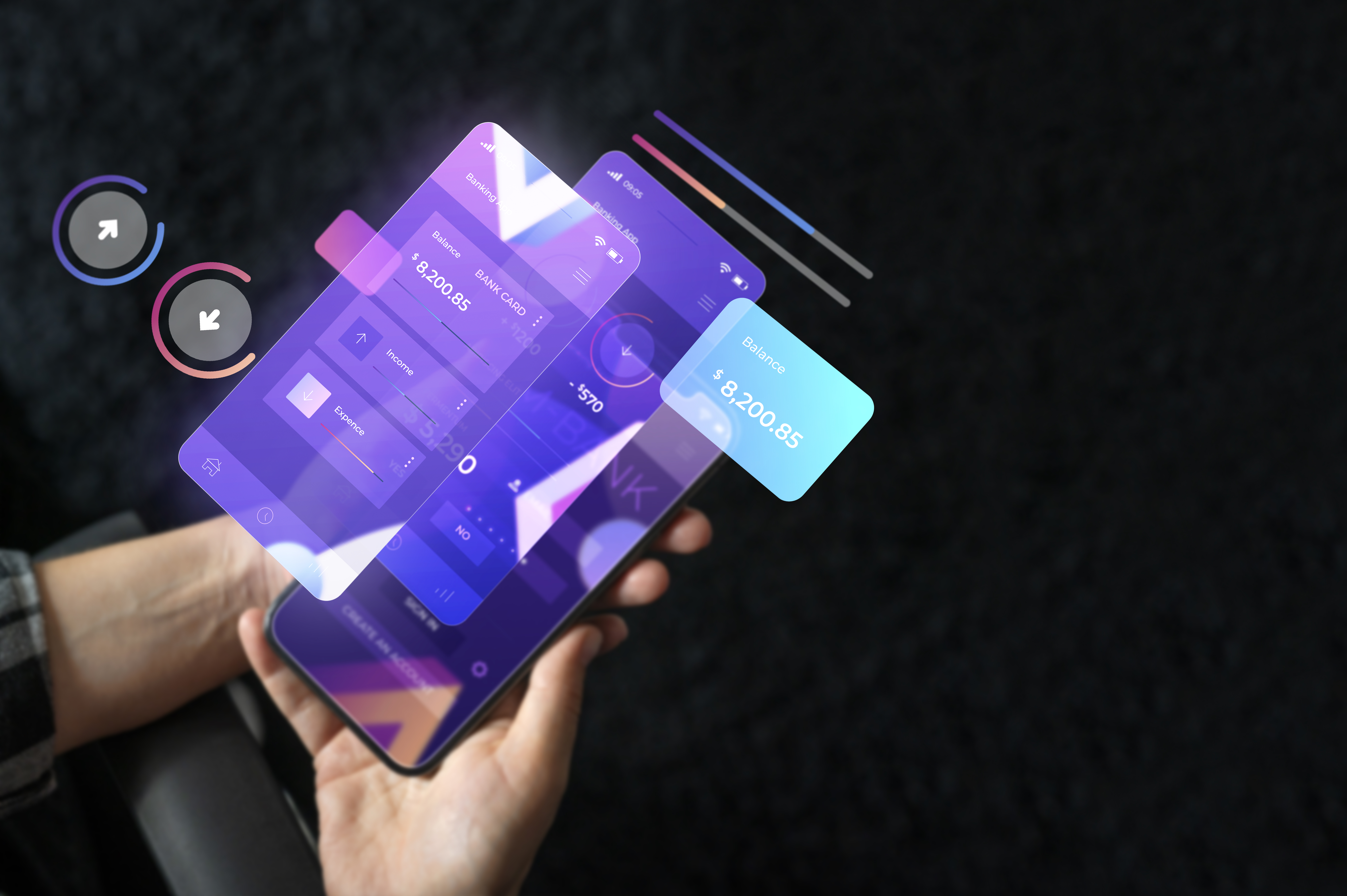
The mobile-first approach is a design and development strategy that prioritizes mobile devices when creating websites and applications. Instead of beginning with a desktop design and adapting it for mobile, this method starts with mobile design as the foundational point, then progressively enhances the user experience for larger screens. The central idea is to ensure that websites are designed to work effortlessly on mobile devices, catering to a significant portion of internet users who primarily use smartphones and tablets.
Principles of Mobile-First Design
Content Priority: In a mobile-first approach, designers emphasize content hierarchy. They carefully select and prioritize content to ensure that the most critical information is readily accessible on smaller screens. This forces a focus on essential elements, reducing clutter and improving the user experience.
Performance Optimization: Mobile devices often have limited processing power and bandwidth. Designers must optimize assets, minimize HTTP requests, and ensure fast loading times. Efficient coding and resource management are key to delivering a responsive and high-performing mobile experience.
Touch-Friendly Design: Mobile devices primarily rely on touch-based interactions. Designing for touch involves creating larger touch targets, intuitive gestures, and interactions that are natural and user-friendly on smaller screens.
Responsive Typography: Text readability is crucial on mobile devices. The mobile-first design incorporates responsive typography that scales gracefully across different screen sizes, ensuring that text remains legible and visually appealing.
Adaptability: The mobile-first approach emphasizes adaptability to various screen sizes and orientations. Designers ensure that websites look and function well on devices ranging from small smartphones to larger tablets and desktop monitors.
Progressive Enhancement: This approach begins with a simple, functional mobile design and progressively adds features and content for larger screens. This ensures that all users, regardless of their device, receive a core functional experience.
Advantages of Mobile-First Design
Improved User Experience: Designing for mobile-first encourages a cleaner, more user-friendly design that makes content more accessible and reduces distractions. Users appreciate a seamless and intuitive experience.
Faster Loading Times: Optimizing for mobile typically leads to faster loading times, benefiting both mobile and desktop users. This optimization enhances page speed, positively impacting search engine rankings.
Enhanced SEO: Search engines like Google prioritize mobile-friendly websites in their search results. A mobile-first approach can improve a website's SEO, driving more organic traffic.
Cost Efficiency: By addressing mobile design challenges upfront, the mobile-first approach can be cost-effective. It helps prevent expensive retrofits and revisions later in the development process.
Future-Proofing: As the mobile landscape continues to evolve with new devices and screen sizes, the mobile-first approach ensures that websites remain relevant and functional in the face of these changes.
Challenges in Mobile-First Design
While the mobile-first approach offers numerous benefits, it comes with its fair share of challenges:
Limited Screen Real Estate: Smaller screens pose limitations on how content is displayed. Designers must make tough decisions about content prioritization and structure to ensure a positive user experience.
Touch-Based Navigation: Designing for touch requires a different approach compared to traditional mouse and keyboard interactions. Designers must create touch-friendly interfaces with larger touch targets and intuitive gestures.
Performance Optimization: Mobile devices have limited resources, making performance optimization crucial. This includes reducing image sizes, minimizing HTTP requests, and optimizing code.
Content Prioritization: Deciding what content to display on smaller screens can be a complex task. Designers must identify essential content while ensuring access to less critical information for larger screens.
Cross-Browser and Cross-Platform Compatibility: Mobile-first design extends to various devices, operating systems, and browsers. Ensuring consistent rendering and functionality across this diverse landscape is challenging.
Testing and Debugging: Rigorous testing and debugging are necessary to identify and fix issues on different devices and screen sizes. Emulators, simulators, and real device testing are all vital for comprehensive testing.
Implementing Mobile-First Design
To successfully implement a mobile-first design, consider the following best practices:
Content Strategy: Begin with a comprehensive content strategy that identifies the most critical information and user needs. Prioritize this content for mobile devices.
Responsive Frameworks: Utilize responsive web design frameworks like Bootstrap or Foundation to streamline the design process and ensure consistency across various devices.
Progressive Enhancement: Implement progressive enhancement by starting with a basic, functional mobile design and gradually adding features for larger screens.
Touch-Friendly Design: Design touch-friendly interfaces with larger touch targets and consider touch gestures when developing interactions.
Performance Optimization: Optimize performance by minimizing HTTP requests, optimizing images, and using efficient code. Utilize tools like PageSpeed Insights and Lighthouse for performance analysis.
Cross-Platform Testing: Test your website on a wide range of devices, browsers, and operating systems to ensure compatibility. Real device testing is essential for identifying device-specific issues.
User Feedback: Gather feedback from real users, especially those using mobile devices. User testing provides valuable insights into usability issues and areas for improvement.
Best Practices for Mobile-First Design
To craft an experience that prioritizes user-friendliness and performance optimization when adopting a mobile-first approach, it is essential to adhere to specific best practices. When executing a mobile-first design strategy, these critical guidelines should be top of mind:
Content Prioritization: Identify and prioritize the most essential content and features for mobile users. Consider what users need the most when accessing your website on a small screen.
Progressive Enhancement: Start with a basic, core design that functions well on mobile devices. As screen size and capabilities increase, enhance the design progressively to take advantage of larger screens without compromising the mobile experience.
Responsive Grids and Layouts: Use fluid grids and flexible layouts to create designs that adapt seamlessly to different screen sizes. Employ CSS grid and flexbox layouts to achieve this adaptability.
Fluid Typography: Implement responsive typography by using relative units like percentages, ems, or rem to ensure that text scales appropriately across devices. This helps maintain readability.
Performance Optimization: Optimize performance by reducing the size of images and other assets. Use lazy loading for images to improve load times. Minimize HTTP requests and use browser caching.
Mobile-First CSS: Write your CSS with mobile devices in mind as the initial target. Use media queries to add styles for larger screens. This ensures that the baseline design is mobile-friendly.
Touch-Friendly Design: Ensure that interactive elements like buttons and links are adequately sized and spaced to accommodate touch interactions. Avoid small, closely packed elements that can be difficult to tap accurately.
Navigation Menus: Use simple and intuitive navigation menus for mobile devices. Consider off-canvas menus, accordion menus, or other mobile-friendly navigation patterns to save screen space.
Testing and Debugging: Test your design across a variety of real devices and use browser developer tools to simulate different screen sizes. Pay attention to performance, usability, and cross-browser compatibility.
Accessibility Considerations: Ensure that your design is accessible to all users, including those with disabilities. Use semantic HTML, provide alternative text for images, and test with screen readers and other assistive technologies.
User-Centred Approach: Continuously gather user feedback and data to refine your mobile-first design. User testing and analytics can reveal areas for improvement and help you make data-driven decisions.
Keep Mobile in Mind during Content Creation: Encourage content creators to produce concise and easily digestible content suitable for mobile users. Avoid long paragraphs and use headings and bullet points for better readability.
Cross-Browser and Cross-Device Testing: Regularly test your design on various browsers and devices to ensure consistent functionality and appearance. Consider using responsive design testing tools and services.
Scalable Vector Graphics (SVG): Utilize SVGs for icons and simple graphics, as they can scale without loss of quality and are typically smaller in file size compared to bitmap images.
Mobile-First Frameworks and Tools
You may take advantage of several frameworks and technologies that enhance mobile experience, accelerate development, and ensure cross-device compatibility by adopting a mobile-first design strategy. To create mobile-first websites, web designers and developers can make use of the common frameworks and technologies listed below:
- Bootstrap: Bootstrap ranks among the most extensively utilized front-end frameworks. It adopts a mobile-first strategy, features a responsive grid layout, and includes pre-designed user interface components. Making mobile-friendly and responsive site designs is made easier by it.
- Foundation: Another powerful front-end framework is Foundation, which provides a responsive design element library and a grid structure optimized for mobile devices. It is very adaptable and made to function flawlessly on mobile devices.
- Materialize CSS: Materialize CSS is a framework that implements Google's Material Design principles. It offers mobile-first responsive components, such as cards, buttons, and navigation bars, for creating modern and intuitive mobile experiences.
- Bulma: Bulma is a lightweight CSS framework based on Flexbox. It provides a mobile-first grid system and a set of customizable CSS classes to build responsive layouts and components.
- Semantic UI: Semantic UI emphasizes a semantic, intuitive, and mobile-first approach to web design. It provides a wide range of UI components and responsive grid systems.
- AMP (Accelerated Mobile Pages): Google started the open-source AMP project to develop quicker, mobile-friendly web pages. It enforces strict coding standards and focuses on delivering near-instant loading times for mobile users.
- CSS Preprocessors: CSS preprocessors like Sass and Less can streamline the process of writing CSS. They allow you to create variables, mixins, and reusable styles, making it easier to implement a mobile-first design strategy.
- Responsive Design Testing Tools: There are various testing tools that help you preview your design on different screen sizes and devices. Notable options include Browser Developer Tools (e.g., Chrome DevTools), Responsinator, and BrowserStack.
- Mobile Emulators and Simulators: Mobile emulators and simulators allow you to test your design on virtual mobile devices. Tools like Genymotion (for Android), Xcode Simulator (for iOS), and BrowserStack provide access to various virtual devices.
- Performance Optimization Tools: Tools like Google PageSpeed Insights, GTmetrix, and WebPageTest help you analyze and optimize the performance of your mobile-first designs. They provide suggestions for reducing page load times.
- Responsive Images Tools: Tools like ImageOptim, Squoosh, and Responsive Images Generator help you optimize and create responsive images that load quickly on mobile devices.
- Mobile Design Pattern Libraries: Libraries like the Mobile Design Pattern Gallery and the Mobile Patterns collection offer inspiration and best practices for designing mobile user interfaces.
- Framework-Specific Extensions: Some frameworks offer extensions and plugins that enhance mobile-first design capabilities. For example, Bootstrap has additional extensions like Bootstrap Select for better mobile select inputs.
- Accessibility Tools: Making sure your mobile-first design is accessible to all users, including those with impairments, is made easier with the use of tools like Axe, aXe Coconut, and WAVE Accessibility Evaluation Tool.
You may expedite the development process and improve the mobile user experience by creating designs that are accessible, performance-optimized, and responsive across a range of devices with the help of these frameworks and tools. The particulars of your project and your familiarity with these technologies may have an impact on the framework or tool that you select.
Future Trends in Mobile-First Design
Mobile-first design is an evolving field that keeps up with technological advancements. To produce creative and intuitive mobile experiences, designers and developers must stay ahead of emerging trends. The following are some new developments in mobile-first design:
Foldable Devices and Dual Screens: Foldable smartphones and devices with dual screens are gaining traction. Designing for these devices requires adapting to new form factors and creating experiences that take full advantage of the expanded screen real estate.
5G and High-Speed Connectivity: The rollout of 5G networks offers faster and more reliable internet connectivity. This will enable designers to incorporate richer media, augmented reality (AR), and virtual reality (VR) experiences in mobile design.
Progressive Web Apps (PWAs): PWAs are web applications that offer a native app-like experience on the web. They are installable, offline-capable, and responsive by default. As support for PWAs grows, designers will need to focus on creating responsive and seamless web app experiences.
Voice User Interfaces (VUI): Voice-controlled interfaces are becoming more common with the rise of smart speakers and voice assistants. When integrating voice user interface (VUI) into their mobile-first approach, designers must prioritize voice-friendly interactions and content.
Virtual Reality (VR) and Augmented Reality (AR): Industries like e-commerce, gaming, and education are increasingly embracing mobile applications that leverage AR and VR. A thorough grasp of 3D locations, immersive experiences, and responsive design for mobile devices and headgear are necessary when designing for AR and VR.
Haptic Feedback and Gestures: Haptic feedback and gesture-based interactions are enhancing the mobile user experience. Designers need to consider how haptic feedback and gestures can improve user engagement and navigation.
Dark Mode Design: The ability to use dark mode on websites and mobile apps has grown in popularity. When designing for dark mode, contrast, color selections, and user preferences must all be carefully taken into account.
Personalization and Contextual Design: Leveraging user data and AI, mobile-first design is moving toward highly personalized and context-aware experiences. Tailoring content and interactions to individual users can improve engagement and satisfaction.
Sustainability and Eco-Friendly Design: Eco-friendly user behaviors and energy conservation are two examples of sustainable design principles that are becoming more and more popular.
Biometric Authentication: With fingerprint scanners, facial recognition, and other biometric authentication methods becoming standard on mobile devices, designers need to consider the user experience of these features.
Enhanced Security and Privacy: As privacy concerns grow, designers should focus on creating mobile designs that prioritize data security and give users more control over their data.
Accessible and Inclusive Design: The main idea will still be inclusivity. It is ensured that all users, including those with impairments, can access and interact with your mobile content when you design with accessibility in mind.
Micro interactions and Animations: Delightful micro interactions and subtle animations are being used to improve user engagement and guide user interactions. These should be designed with performance in mind.
Sensory Feedback: Designing for sensory feedback, such as vibrations and sound cues, enhances the user experience. This is important for mobile games, fitness apps, and accessibility features.
You can stay on top of the game and produce cutting-edge, user-focused mobile experiences by keeping an eye on these new trends and modifying your mobile-first design strategy to include them. Mobile-first design will change as technology develops to satisfy consumers' ever-evolving requirements and expectations.
Tips for Developers and Designers
For the purpose of developing efficient and user-friendly online experiences, developers' and designers' guidelines for mobile-first design are crucial. The following are some helpful pointers for developers and designers alike:
For Developers:
Master Responsive Web Development: Gain expertise in CSS, media queries, and responsive design principles to ensure that your code adapts seamlessly to various screen sizes.
Use Frameworks and Tools: Familiarize yourself with mobile-first frameworks and development tools like Bootstrap, Foundation, and responsive design testing tools to streamline your workflow.
Optimize for Performance: Prioritize performance optimization by minimizing HTTP requests, optimizing images, and using techniques like lazy loading. Use tools to measure and improve page load times.
Embrace Progressive Enhancement: Start with a solid, mobile-friendly foundation and progressively enhance your design for larger screens. This approach ensures that your design remains user-friendly across all devices.
Test Thoroughly: Test your designs on real devices and use developer tools to simulate different screen sizes. Pay close attention to cross-browser and cross-device compatibility.
Learn About Accessibility: Understand accessibility standards and best practices to ensure your designs are usable by individuals with disabilities. Test your projects with assistive technologies.
Stay Updated: Keep up-to-date with the latest web technologies, browser features, and best practices. The web development landscape evolves rapidly.
Version Control: Use version control systems like Git to track changes and collaborate with other developers efficiently.
Learn JavaScript: A strong tool for developing responsive and engaging online experiences is JavaScript. Learn about JavaScript, current frameworks like React or Vue.js, and libraries like jQuery.
For Designers:
Prioritize User-Centered Design: Start with a clear understanding of your target audience and their needs. Design with empathy and consider user preferences.
Content First: Focus on content hierarchy and clarity. Content is key in a mobile-first approach, so make sure it's well-organized and easy to access.
Mobile-First Wire Framing: Begin the design process with mobile wireframes. This forces you to prioritize essential elements and create a user-friendly mobile experience.
Understand Typography: Choose readable fonts and create a scalable typography system that adapts to different screen sizes.
Simplify Navigation: Develop straightforward and intuitive navigation menus for mobile users. Consider patterns like off-canvas menus and accordions.
Mobile-First Mockups: Create mockups and prototypes for mobile devices before scaling up to larger screens. Pay attention to spacing, touch targets, and overall usability.
Embrace Minimalism: A clean and uncluttered design works well on mobile. Remove unnecessary elements and embrace minimalistic design principles.
Design for Touch: Ensure interactive elements like buttons and links are touch-friendly by making them adequately sized and spaced.
Use Responsive Design Tools: Employ design tools that facilitate responsive design, like Adobe XD, Figma, or Sketch, which offer responsive design features and device previews.
Collaborate with Developers: Maintain open communication and collaboration with developers to ensure that your designs can be implemented effectively.
Stay Informed: Keep yourself updated on design trends, usability studies, and emerging technologies that may impact mobile design.
Usability Testing: Conduct usability testing to gather feedback from real users and refine your designs based on their insights.
Design with Performance in Mind: Consider the performance implications of your design choices. Optimize images and animations to maintain fast load times.
Both developers and designers play crucial roles in creating successful mobile-first designs. It takes collaboration and a shared understanding of the principles and best practices of mobile-first design to create outstanding user experiences.
In the ever-evolving and dynamic world of technology, the web design industry has demonstrated its adaptability and ingenuity by adopting mobile-first approaches. We've seen firsthand the revolutionary potential of giving mobile devices priority when creating digital experiences through our investigation into responsive design. Despite the challenges posed by limited screen real estate, touch-based navigation, and diverse device landscapes, the benefits are undeniable. In addition to increasing user engagement and search engine rankings, a mobile-first approach future-proofs digital assets and guarantees that websites are visually appealing and accessible across a variety of platforms. Upon concluding our journey, it becomes apparent that the mobile-first strategy is a philosophy that embraces the spirit of technical innovation and user-centricity, rather than only serving as a design guideline. Embracing these methodologies and overcoming the challenges, designers and developers pave the way for a more inclusive, seamless, and responsive digital future, where user experience reigns supreme and boundaries between devices fade away.
Recent Stories


500k Customer Have
Build a stunning site today.
We help our clients succeed by creating brand identities.
Get a Quote